


Technology
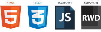
Anderlecht-online.be uses the most recent web technologies. A combination of HTML 5, CSS 3 and JQuery brings you the most optimal conditions on most (modern) devices and browsers.
Anderlecht-online.be uses the most recent web technologies. A combination of HTML 5, CSS 3 and JQuery brings you the most optimal conditions on most (modern) devices and browsers.
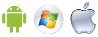
Anderlecht-online.be was tested on the most recent versions of Android, iOS and Windows Phone. But normally the website should function perfectly on other modern operating systems as well. The site will resize to all screen sizes, independent from your device type.

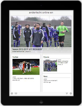
Anderlecht-online.be uses a responsive design. Our old mobile mini-site is therefore obsolete. Responsive design means that the website resizes automatically to a fully function page on all screen sizes. The page content is automatically re-organized and the focus is placed on the most important content without zooming or pinching. Also tables, that are usually too wide for mobile screens, are re-organized and shown in a usable format. On desktops, a horizontal menu is used. On mobile devices, you can use a vertical touch enabled menu. Even photo and video sliders are touch enabled.
Anderlecht-Online.be is available on Google Currents. You can download this application from the Google Play Store or from Apple iTunes. Via Google Currents you will receive the most recent Anderlecht news, pictures and videos. Subscribe via this URL:
https://www.google.com/producer/editions/CAowsbLhAw/anderlecht_online_en
The easiest way to visit our site is through your browser, with the device of your choice.

In the future, Anderlecht-Online.be will also be made available on applications such as Flipboard, StumbleUpon, Kiosk, etc... We might even make our own application. Our goal is to support as many platforms as possible. We will keep you posted through our news posts.


